Boston Responsive Web Design Service
Boston Web Design Agency is the way to go for meeting all your web design demands. We offer a variety of services including fluid grids, fluid images, web development, and site maintenance to ensure that your website gets the attention it deserves. In a competitive market like Boston, having a responsive website helps businesses stand out. Customers are more likely to engage with a site that is easy to navigate and visually appealing, regardless of the device they are using. This leads to higher customer satisfaction and increased conversion rates. Moreover, search engines favor responsive websites, which means a better search engine ranking and more visibility for your business. This increased visibility can drive more traffic to your site, resulting in more potential customers.
150+ Google Reviews
Experienced Team
24/7 Technical Support
Our Web Design Is No Less Than Perfect!
At Boston Design Agency, our specialty lies in creating a website that adjusts itself to the device or the screen that you are using. Users can access, navigate, and use our websites without any hurdles. We make browsing a piece of cake. Because let’s face it! Nobody wants to strain their eyes and zoom in using their fingers to read micro content. We endure that mobile surfing becomes easy with our intelligent and responsive design services.
How Our Responsive Web Design Service Helps Expands Your Business
According to the Consumer Technology Association, more people around the world own a mobile phone than a toothbrush. We talk about face-to-face meetings in today’s era? Well, that’s old-fashioned now. The world has opted for a new way for meetings and that’s face-to-screen! And talking honestly, the use of mobile phones is not going to regress, rather it’s going to progress even more.
Consumers use their mobile phones to access websites rather than using laptops and computers. According to the stats, users are spending 69% of their time using social media. And 80% of it is on mobile phones. 57% of users admit that they would never recommend a business whose website is poorly designed. 61% of users say that they wouldn’t go for an unfriendly website and 40% out of those would go for competitor sites. Our goal is to create a website that is easy to navigate, user friendly and responds on every device, be it a cell phone or a desktop. Users never lose interest in our sites and keep coming back to them which automatically increases your business sales and revenue.
Our Client Interaction
In every step of progress, we make sure to connect with our clients. Building a powerful relationship with our clients helps us to understand their needs and goals better. We get to know what kind of website design they are expecting from us and then we work more effectively to provide them the results according to their expectations.
You may think how effective communication with clients helps us? Well, customer satisfaction is our priority and we do not compromise on it. Client’s feedback on our work is of high importance and helps us to overcome any potential problems in our work and services. Afterall, a happy client is a repeat client!
Consult our web design agency today, and let us help you create a custom web page design and guide you through every step of your online success.
Book a meeting!
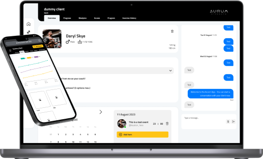
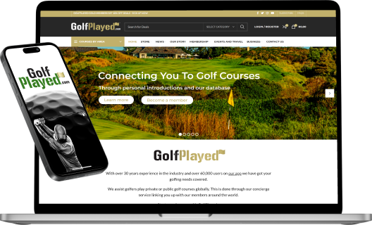
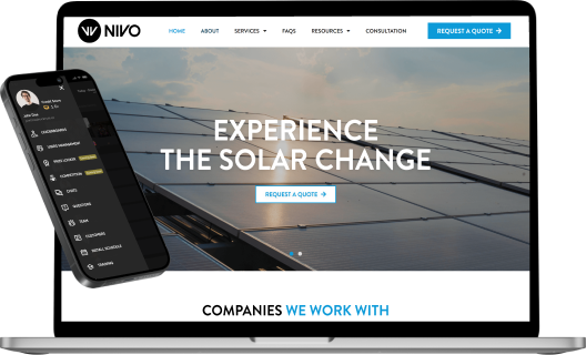
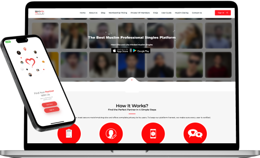
Our Latest Web Design Projects
We Construct Personalized Projects
Fluid Grids
We design your website in a manner that you get a flexible grid system where the website’s width and margins change with the type of device you are using.
Fluid Images
Never worry about pixelated or stretched images with our fluid image services. We code your website to adjust the images according to your device size.
Media Queries
We are using a special CSS service to make sure that your site’s content fits according to the device size so you don’t have to worry about any missed content.
Our 5 Golden Rules of Responsive Web Designing
We use five critical expert rules for our working process to make your Website effortlessly excellent and responsive.
1- Mobile-first approach
Our mobile-first approach allows us to create websites that are functional and optimized for mobile users. We make sure that the content is easily readable for mobile users as they have limited screen space
2-Fluid Grid System
We adopt a fluid grid system to make sure that the content flows without any hurdles across different screen sizes. This allows the users to have a smooth and attractive experience regardless of the kind of device they are using.
3-Touch-friendly elements
We optimize the website design for touch-friendly elements as this is different from mouse-driven interactions. Incorporating this element allows to increase the usability and reduce the frustration for cell phone users.
4- Content flexibility and readability
Content is the core of any web design so we ensure that the content on our website is organic and well-researched. Moreover, we make sure that the content is easily readable by using appropriate font sizes and designs.
5-Speed and Efficiency
We understand that users may get frustrated with slow processing websites but you don’t have to worry about turtle-speed websites with us. We make sure that our websites are fast-loading, efficient, and smooth running.
Website Design Services FAQs
And so you have questions... We have answers.
1. What is responsive web design, and why is it important for my business?
Responsive web design ensures that your website adapts to various devices and screen sizes, providing an optimal viewing experience. This is crucial as more users access websites via mobile devices, and a responsive design improves usability, engagement, and ultimately boosts your business by retaining and attracting more customers.
We get many questions about our responsive design services. We hope you’ll find answers to the most common question asked here. And if you’ve got any other questions, you can contact us here.

We employ a mobile-first approach, designing websites that prioritize mobile usability from the start. This includes using fluid grids, fluid images, and media queries to ensure content adjusts seamlessly across all devices. We also optimize touch-friendly elements to enhance mobile user experience.
Fluid grids are flexible layouts that adjust the website’s width and margins based on the device size, while fluid images scale appropriately without pixelation or distortion. These features ensure your website looks great and functions well on any device, providing a consistent and professional appearance.
We focus on optimizing various aspects of web design to ensure fast loading times. This includes efficient coding practices, optimizing images and media, and utilizing reliable hosting services. Fast-loading websites reduce user frustration, improve user experience, and enhance search engine rankings.
We prioritize client communication throughout the design process. Regular check-ins and updates ensure that we understand and meet your expectations. Client feedback is invaluable to us, and we make necessary adjustments based on your input to ensure the final product aligns with your vision and goals.