When people talk about web design, they often use the terms “responsive design” and “reactive design.” Both are beneficial in some ways, but knowing their differences is essential to selecting the best one for your website. This article extensively details responsive vs. reactive web design so that you can make an intelligent choice for your website.
Demands Of Website Design
The most used website design by companies is responsive web design. It accounts for most of the websites on the Internet. By 2024, 90% of websites will use responsive design, accounting for 71 billion websites today.
Responsive web design is a recent trend among web design agencies and website-building solutions. More importantly, it is also considered an essential element of web design.
Companies like Boston Web Design Agency have their own website-building feature, where users get templates for samples of responsive websites depending on their sector. Such designs look good on any screen, including mobile screens.
Importance Of Website Design
Web design is one of the defining qualities in building a client’s perception. Statistics developed by Stanford University and other renowned universities prove that 75% of users’ evaluation of a company’s credibility is based on the design of its website. If the website’s design and theme are not relevant to its desired demographics, it will fail to attract clients.
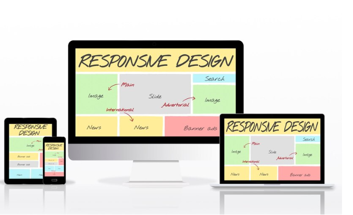
What Is Responsive Web Design?
Today, the most widely used web design is Responsive web design, but why is that? And what is responsive web design?
Responsive web design adapts to user preferences so that the user does not need to keep readjusting the size of images, scroll or swipe through content, or bounce through pages. It helps improve on-screen experiences, and it means no extra touches to scroll through a page or look at content written in very small letters on a much smaller screen.
Responsive design enables a website’s layout to adapt to the user’s device right away, whether the site is viewed horizontally or vertically. In other words, responsive design
facilitates the site to function correctly and makes it aesthetically pleasing whether one accesses it from a personal computer, laptop, or even a phoneResponsive design equips the website to transform based on interactions and the devices’ type by using media queries, fluid grids, and pictures that can be stretched or curled. It makes the user experience less obtrusive and can lead to a greater number of people engaging with and purchasing from you.
Responsive Web Design Features
Flexible layouts:
Responsive web designs change their layouts according to the size of the screen, making it readable and easily comprehensible
Media Queries:
Media Queries are coding rules that help a website adapt according to the requirements
Fluid Images:
Fluid images can change the size to fit the screen without losing resolution or messing up the flow
Mobile-Friendly Navigation
For mobile friendly version, responsive designs make the buttons easy to set up so that it make sense on smaller screens and are easy to tap through on touch screens
Faster Load Times:
Responsive web designs make pictures and code work for mobiles and help speed up the loading process, improving the user experience
What Is Reactive Web Design?
Creating web design involves building websites that can easily adjust to devices and screen sizes. When a website is developed with an approach, it ensures that it appears and works well on gadgets like laptops, tablets, and smartphones. Unlike fixed web designs, responsive web design uses layouts and elements that adapt smoothly to the users device.
Our primary focus is providing an optimized user experience across platforms and screen resolutions. This goal can be achieved by incorporating web design principles, which help developers improve accessibility, usability, and overall user satisfaction. By embracing these principles, websites can become more inclusive and user-friendly and meet the preferences and needs of today’s users. Additionally, responsive web design enables websites to remain efficient and effective in an evolving environment.
Responsive Web Design Features
Grid System:
Content is arranged in rows and columns, simplifying the structure and organization of content on web pages and improving the website’s performance.
Efficiency:
Provide users with efficient, uninterrupted operation.
Functionality and Advantages of Web Design
- Design for better results using a single codebase
- Get the same experience on all devices
- Flexible and adaptable layout and functionality
- Only a single set of URLs for better SEO
- Save money on a small site
- Lots of customizations for all devices
- Ability to modify files and functional properties
- By reducing assets and code to speed up
- Many display scenarios can be adapted to any device
- Simple websites and web applications work well with it.
What Should be used in them?
Choosing responsive and responsive web design depends on your specific needs and goals. Responsive design is the best way to create a website that works well and looks good on all devices. You don’t need to know coding. However, if you want to give more users and enjoy the change immediately as a user, the design will be better for you.
Boston Web Design Agency
Our Boston web design company is the best web design company in Boston that provides responsive and responsive web design. This means the websites we create can adapt to different devices and screen sizes. For example, a well-designed website can work on other browsers and devices. Our web design company offers services for creating websites that adapt to every device and screen size. We also provide responsive services that promise to respond to your questions or updates about your website quickly. Our team comprises web designers who can make changes and updates on the fly to keep your website current and functional.
Final Thoughts
In conclusion, responsive and reactive web design has strengths and weaknesses. Before deciding, it’s essential to consider your objectives and budget carefully. Whichever approach you choose, ensure your website provides a seamless and enjoyable user experience across all devices.
FAQs
What is a Boston web design agency?
A Boston web design agency specializes in creating websites for businesses in the Boston area. They design and develop websites to help companies to showcase their products or services online.
What is responsive web design?
Responsive web design is an approach to web design that ensures that web pages render well on a variety of devices and window or screen sizes. This ensures that users have a good experience no matter what device they use to access the website.
What is creative web design?
Creative web design is the process of creating websites that are visually appealing and creative. This includes using unique layouts, colors, fonts, and images to make the website stand out and engage users.
Why is responsive web design important?
Responsive web design is essential because it ensures that websites are user-friendly and accessible on all devices, including mobile phones and tablets. This helps businesses reach a wider audience and improve user experience.
How can a Boston web design agency help with responsive and creative web design?
A Boston web design agency can help businesses create responsive, creative websites that are visually appealing, user-friendly, and optimized for all devices. They have the expertise and resources to design websites that meet their clients’ specific needs and goals.